Knapsack changelog
Flexible Branch Naming

Knapsack has introduced a way for users to start editing faster, while adding the ability to rename branches and preventing conflicts with prior branch names.
To create a new branch use the 'Create New Branch' branch menu item or click the 'Edit' button in the app bar to get started. You'll notice that the branch is now automatically created and doesn't require a user input name to get started.
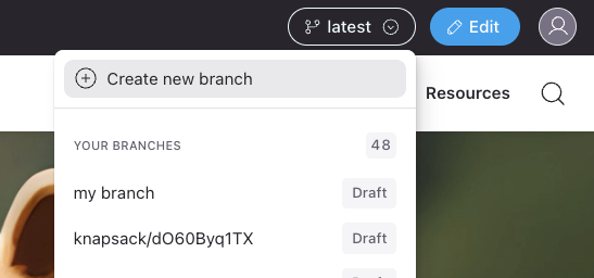
This change allows for quickly editing content without worrying about the branch name or whether it will conflict with previously used names.
There is a new field in use for the instance data that seperates the 'branch name' as is reflected in the git repository and the `branch title' which is the user facing branch name that we see in the UI. This is opens up the ability for renaming the branch for longer running feature work, running demos, etc.
To rename a branch, select the branch dropdown and choose rename branch. In the provided form, enter the new name for the branch and click save.
Note that this only changes the branch name in the Knapsack UI and not in the git provider.
This update opens up future work around improving our cloud authoring and branching experience and reliablility. Be sure to send any feedback about these updates to [email protected] as we continue to improve the experience.
Slot Layout Options

While some teams choose to preconfigure how content within a slot will appear, there are times where additional controls are needed to achieve a desired outcome.
Our Layout Options give your team the tools to adjust the content within a slot to align with guidelines.
General Options
Layout
Choose between Horizontal, Vertical, or Wrap.
Align
Choose between Top Left, Top Center, Top Right, Left, Center, Right, Bottom Left, Bottom Center, and Bottom Right.
Gap
Control the horizontal or vertical spacing between items based on your Layout setting. Use a dimension token, or set a static pixel, rem, or percentage value.
Padding
Choose to control the horizontal and vertical padding of the slot itself. You can also toggle on "Individual Padding" to control separate entries for top, bottom, left, and right padding values.
Use a dimension token, or set a static pixel, rem, or percentage value.
Theme
With variable collections configured you'll have the option to apply a different mode to the slot itself. This can be helpful when demonstrating adjusting a density mode of part of a component while the overall component uses a different mode.
CSS Classes
Many systems rely on CSS systems to achieve desired outcomes such as Tailwind. Apply a flexible space separated list of CSS classes to adjust and style the slot for your needs.
Improved UX for Managing Items
Items can now be added quickly with a simple menu, rather than navigating a multi step form.
Items are now always duplicated when adding to prevent unintended changes appearing across the workspace.
Items can be reordered by drag and drop.
Command Bar

Knapsack has a new Command Bar which allows quickly jumping to content or actions in your workspace. Hit Cmd+K or click search icon to open it, then start typing to find what you're looking for. Here's a few things that can be done with it:
Quickly jumping to pages or patterns
Searching design tokens and copying their values
Adding content
We'll be adding more actions and content to the command bar soon. Please let us know what you think and what actions or content would be helpful to add. Have a great day!
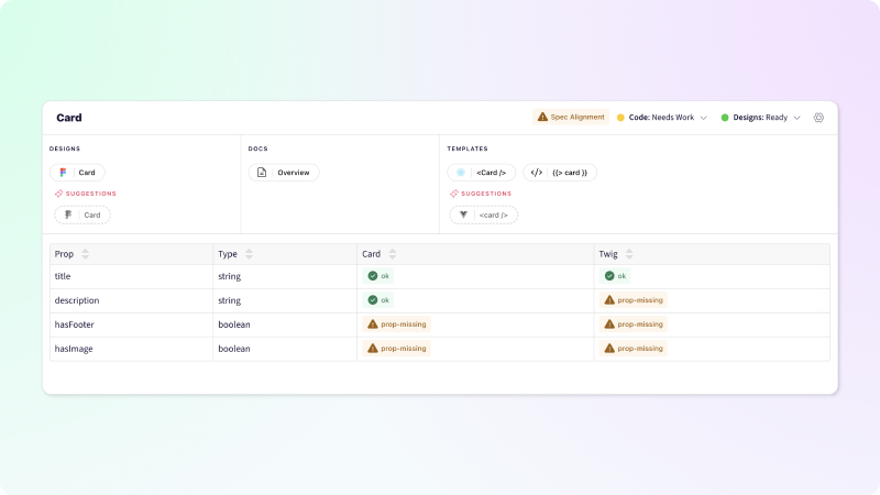
Improved Pattern Management

We're excited to introduce a significant improvement to your pattern management, aimed at empowering your design and development workflow like never before. With our latest update, managing your patterns is a breeze. Access all your patterns from a single, centralized location.
Effortless Pattern Creation: Need to create a new pattern on the fly? We've got you covered. Dynamic suggestions make pattern creation a snap. Quickly generate new patterns with ease, saving you time and effort.
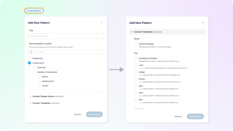
Identify Design-Code Gaps: Bridging the divide between design and code is essential for seamless development. With our latest update, you can pinpoint gaps where design and code aren't aligned, ensuring a smoother transition from concept to implementation
Pattern Tab Privacy Management

Control the role needed to to access a pattern tab the same way you've managed navigation items. You can also hide a tab entirely from your latest documentation.
Composing Patterns with Knapsack
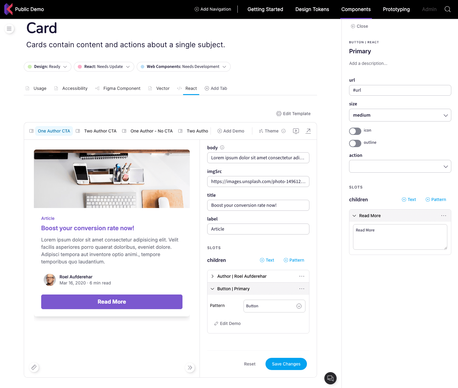
When exploring your component's possibilities through it's props and variations on our Pattern Stage it is much easier to work with the sub-components present with our new release! Imagine you are editing the look and feel of a Card component and want to adjust how the Button compnent in the Card's footer appears: simply click edit on the Button and then it's edit form slides in from the side. Here's a video showing what that experience is like:
(Here's a link to the video if you have any issues viewing the embed above)
You can even go multiple levels deep, so you're not limited to just Card > Button: you can dive as deep in as you want. This opens up so many exciting possibilities in composing experiences from your carefully crafted components! Being able to construct full page prototypes is now possible. The current stage area is a little tight in screen real estate for that right now, which is exactly why our next up and coming feature is a dedicated Prototyping section that allows for the space to create these experiences. You can expect the Prototyping section very soon; in the mean time take a look at the video below for an example of what can be done:
(Here's a link to the video if you have any issues viewing the embed above)
Figma Integration
Knapsack is excited to announce a powerful new integration with Figma! This integration allows you to connect your Figma design files directly to your Knapsack workspace, enabling a link between your design file and documentation in Knapsack.
Features
Connect Multiple Design Sources: Link as many Figma design files as you need to your Knapsack workspace for a centralized hub.
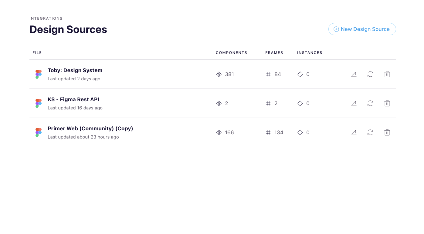
Browse Designs in Context: Easily navigate and explore Figma components, frames, and instances while editing your documentation.

Embed Figma Assets: Directly embed and configure Figma Components, Variants, Instances, and Property Specs throughout your documentation.
Build Powerful Handoff Tools: Leverage design data to create robust handoff and comparison tools, streamlining collaboration.
Sync Updates from Figma: Keep your documentation up-to-date by syncing changes from Figma with a single click.
Getting Started:
To start using the Figma Design Source integration, simply navigate to your workspace settings and connect your Figma account. From there, you can select the design files you want to link and start embedding assets throughout your documentation.
You can find more info on how to begin using Figma in your workspace using our documentation
We're thrilled to bring you this new integration and can't wait to see how you leverage it to improve your design and development workflow. As always, we welcome your feedback and suggestions for future improvements.
Improvements to the Knapsack editing experience
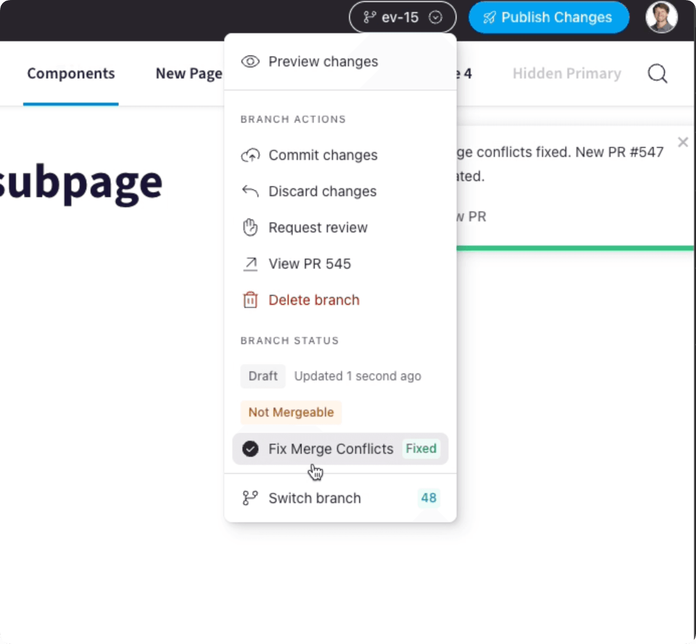
We are seeing more people using Knapsack’s Cloud Authoring tools than ever before and have released a number of updates to help provide a more stable editing experience. Our goal was to largely mitigate merge conflicts that can occur when users are simultaneously making changes to overlapping sections of content.
Merge conflicts often stem from the duration of time a content branch is open in the Knapsack UI before it’s published. Improvements have been made that will reduce the likelihood of merge conflicts upon hitting Request Review or Publish Changes for your branch.
There is now has a Fix Merge Conflicts button to automatically reconcile your changes with competing changes made by other content editors.
Another update is a new UI within the site’s Settings to identify and resolve issues with orphaned content elements, should they arise. Discover how to leverage this feature by visiting our Doctor Tool Documentation.
Our expectation that this should greatly reduce the number of merge conflicts you will experience, and make any you do experience much easier to resolve.
As a bonus, users will also notice a reduction in site load time.
Multi-file Style Dictionary imports for Design Tokens
Importing tokens into Knapsack from Style Dictionary now allows selecting multiple JSON files! Those JSON files can also be in JSON5 format as well.
Guidelines Block
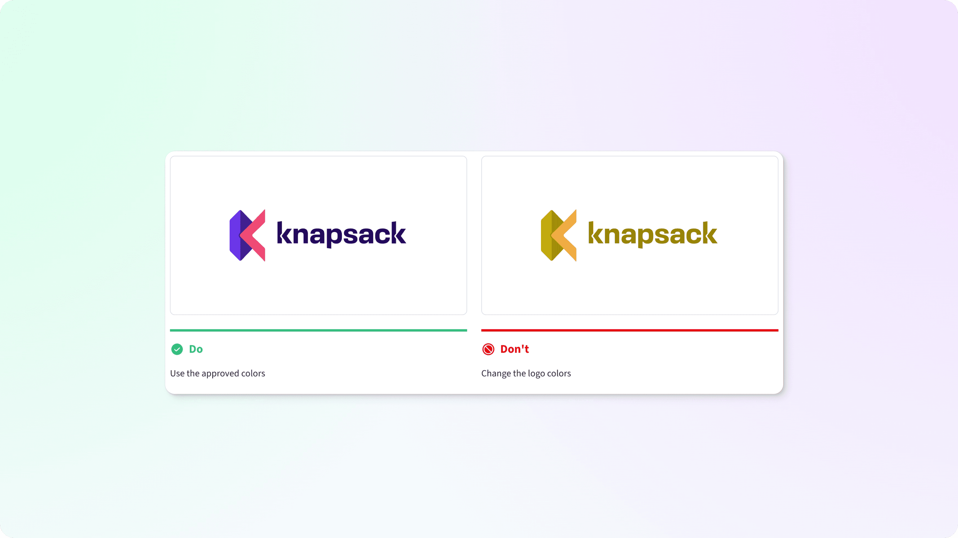
Give examples of how particular components should be used and common mistakes to avoid. Our Guidelines block consists of do’s, don’ts, and cautions. Add as many as you need to help your users create their best work.
Learn how to manage your guidelines
Improve stuff
Improve embed blocks loading experience
Allow mailto links in Shortcut Tiles and Text blocks
Improved Template Adding Experience
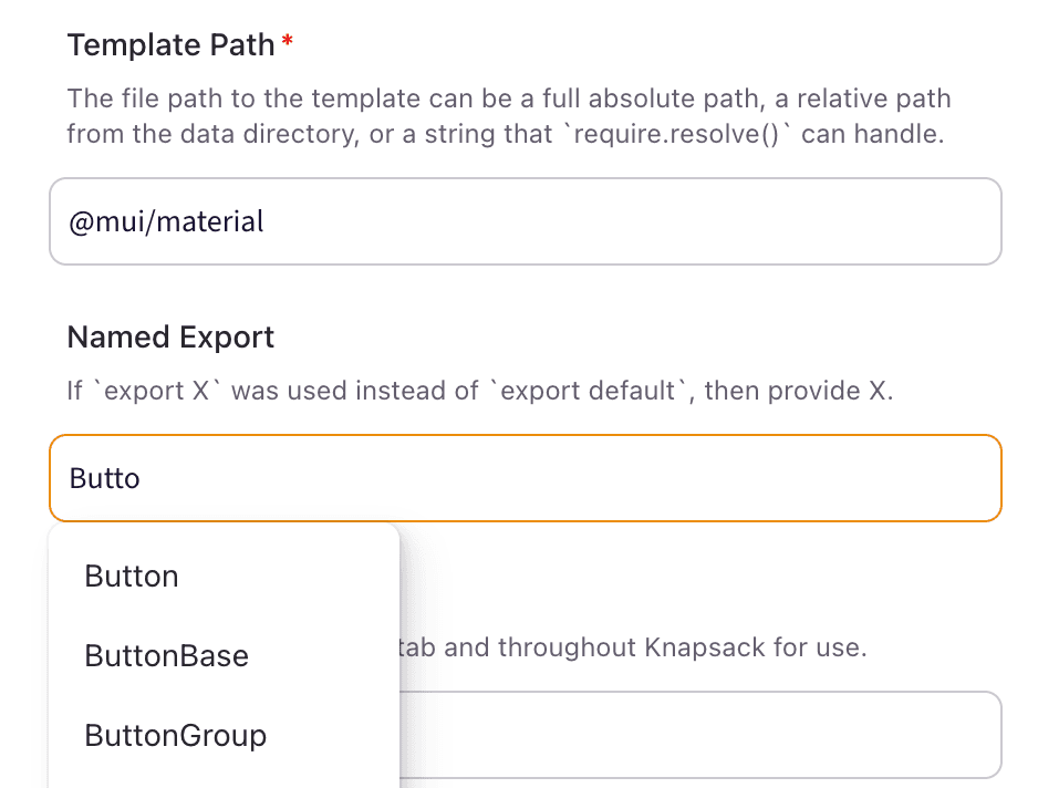
Smooth out UX for adding components to Knapsack with autocomplete forms & suggestions. Adding components is easier than ever - Knapsack now analyzes what components you have that have yet to be added and provides auto complete suggestions. Works with all our renderers across all template languages we support. Be sure to update your Knapsack packages to at least 4.37.0 (run npx @knapsack/update@latest to update).
Infer Spec Improvements
Many improvements have been done to Infer Spec which helps by automatically pulling in prop info from your component code. Extra attention to users of Material UI has been given in this area as well. Be sure to update your Knapsack packages to at least 4.37.0 (run npx @knapsack/update@latest to update)

More improvements & fixes
Children Slot Inference
Docs: System Overview Block
Asset Sets now load when above KS in dir structure
Improve Component Overview Display
Infer Spec no longer Generates Invalid Syntax on Importing MUI's DataGrid Component
Editing token group title no longer destroys all subgroups and tokens
Improve Component Overview Display
Infer Spec improved by using "types" field in package.json for when types are in different directories (like when using "declarationsDir" in "tsconfig.json")
Content Block Headers
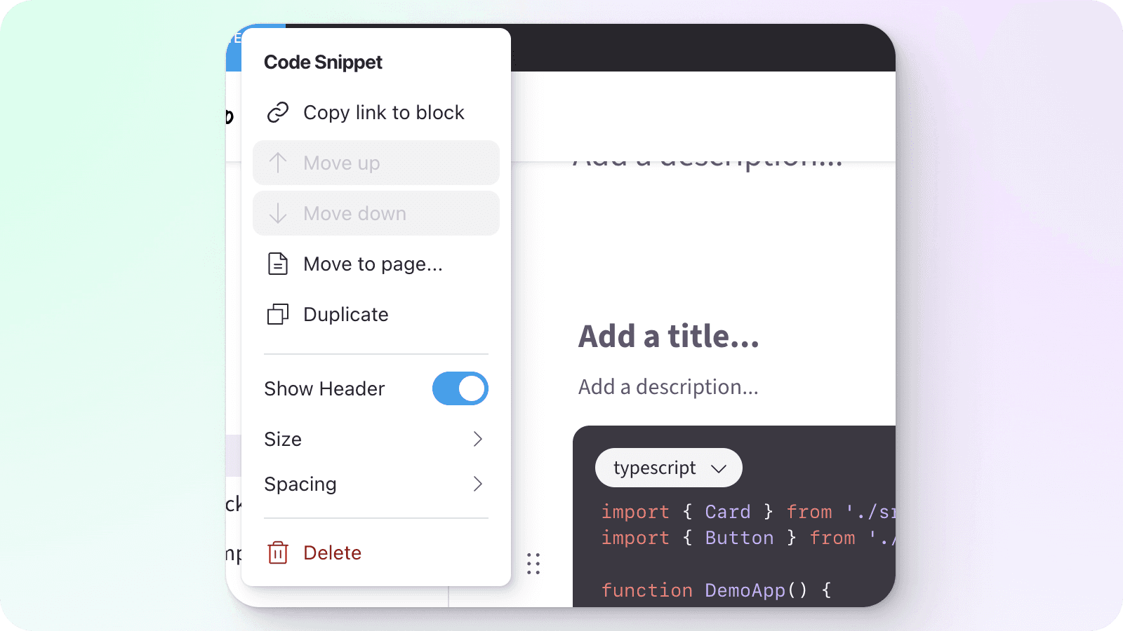
Adds the ability for content blocks to have a header (title and description) that flows with the block in the grid system.
Existing blocks are not affected
Toggle on a header through the Block Menu or go to your workspace settings to have all newly created blocks have the header on be default.
Learn how to manage your content blocks
Improve stuff
Add focus ring to inline links
Add open in new tab button to pattern embed block
Replace text editor link input with link modal
New stuff
Enable filtering of design token output asset files
Reduced Merge Conflicts
We love that Knapsack stores it's content in git and all that it enables: change management, history, rollback, automation, and more! However we've recently heard from you that a spike in merge conflicts when editing content has been experienced and that is no fun! The updates we've put out today will really help this out!
It does require just a bit of action on your end though with running some update commands and committing the migration results. Here's what to do:
Simply run the command below to update past 4.30.0, follow the instructions, and commit the results.
npx @knapsack/update@latestIt's advised to not have ongoing branches that started before this update. Publish the branches before running the update. Once the changes have been pushed up and the App Client has deployed, then editing is safe to resume.
This change pulls all the blocks and demos out of the single db.yml file – each block and demo will be stored as a single JSON file in a dedicated "blocks" or "demos" subdirectory. Individual files are much easier for git to track versus different parts of the same file, so merge conflicts will happen much less often.
If you have any problems, please reach out to [email protected] and we'll be happy to help out!
PR Authors & Resilient Blocks
Published PRs now show username
Improved
Improved resilience in Blocks, enhancing performance and stability.
New Shortcut Tiles Block and more
New Shortcut Tiles block
Page Hero Improvements
Adds option to show Overlay to help text stand out against an image
Adds controls for Contain Image to fit the image inside the hero instead of covering it
Adds controls for Position to allow setting a contained images alignment to Left, Center, or Right
Adds search to add block menu
New
Added ability to toggle Infer Spec when creating templates for more control and customization.
Enhance stage to automatically adjust when components increase in size dynamically.
Improved
Improved organization of table of contents settings for easier customization and navigation.
Improved caching efficiency, reducing knapsack cache size use.
Improved accessibility: Keyboard navigation now highlights anchor tags, making copy links visible when tabbing.
Improved collapsible groups for secondary navigation in order to enhance user experience and navigation efficiency.
Improved user experience for table blocks by resolving various issues and enhancing functionality.
Improved accessibility by adding keyboard navigation to template thumbnails within iframes.
Improvement: Fixed issues with clearing previous paths on incorrect routing
Improved scrolling behavior to prevent links from cutting off main content in webpage.
Fixed
Improved: Enhance detection of missing block IDs in appClientData.
Fixed issue with markdown headings not appearing in table of contents when using links.
Improved template spec tab by fixing toggle issue for "Infer Spec" functionality.
Block moving feature not functioning properly when attempting to move to a different page.
Knapsack Changelog Menu
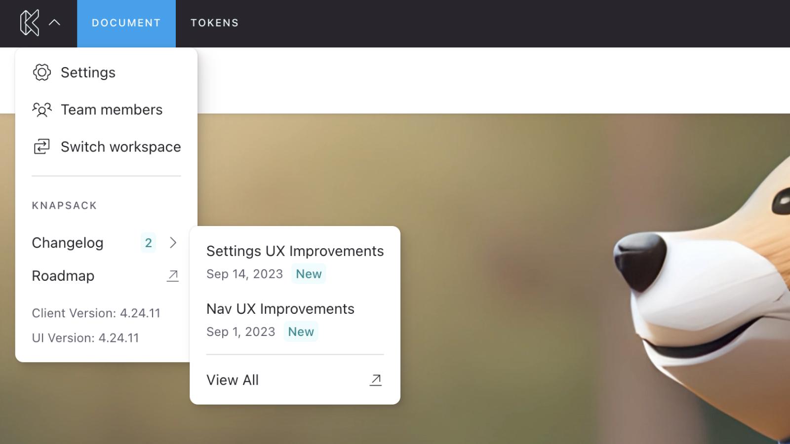
Learn about the newest updates directly in your workspace with the inline changelog menu.
Text Block Image Toolbar
Upload images or add an image via URL and adjust it's alt text for accessibility.
Improved accessibility enhancing keyboard navigation for better user experience.
Error toasts now require user action for dismissal.
Improved build performance.
Settings UX Improvements
Appearance Element Previews
Adds a live preview of the relevant theme-able components, giving users a way to view the effects of their changes.
Fixes & Improvements
Improves user feedback for when settings cannot be edited
Fixes font size field behavior
Fixes color fields not updating when discarding changes
Organizes related appearance items on single pages
Adds ability to reset settings to default
Nav UX Improvements
Primary nav action menu
Added action menu to the the primary nav menu for easier management of the workspace nav
Convert to Pattern Menu Action
Adds action to convert a page to a pattern
Move to Page Menu Action
Adds action to move content type to a page or primary-nav
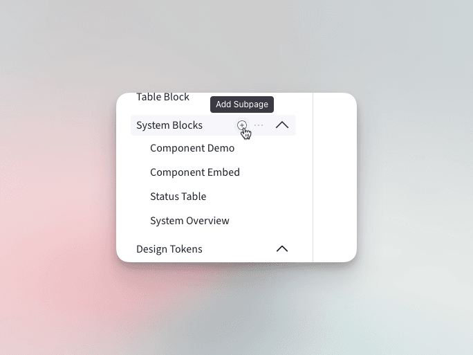
Quickly add child entities
Adds ability to add a child page directly from a nav item
Renames "Add Subpage" to "Add Page" in sidebar footer to differentiate the two actions